Friday, September 18, 2009

jQuery Animated Tree Menu

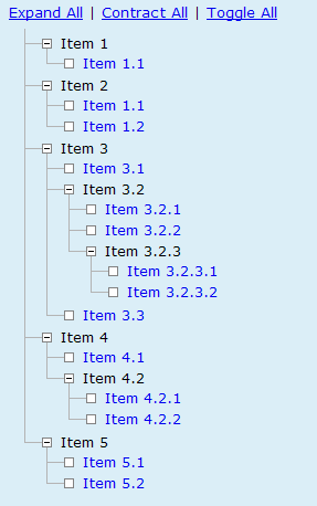
Tree Menu is another important form of navigation menu and is used widely where the content has to be organized in a tree or windows folder like structures. To design our Tree Menu we’ll be using simple unordered lists in HTML and the power of jQuery to animate it. With little CSS trick I have implemented 2 different styles of tree, one by placing the node icon at branch end and second by placing node icon at branch bifurcation.

Benefits of using this Tree Menu:

  1. Zero coding required.
  2. jQuery based Menu compliant with all the browsers.
  3. Easy to manipulate jQuery code.
  4. Functionality for Expanding, Contracting, and Toggling the nodes in one click.
  5. Choose between 2 different styles just by editing only two lines in CSS code.
  6. Minimal CSS used which you can modify based upon your preferences.

This is how the two styles look like:
jQuery Tree Menu jQuery Tree Menu
Style 1: Node icon at branch end. Style 2: Node icon at branch division.


Download other images used for tree branch and nodes (click on image to open in new window):

plus minus blank branch
plus.gif minus.gif blank.gif branch.png

Using the mighty power of jQuery, performing tedious operation on HTML DOM elements like selection and animation just becomes more and more easy. Using jQuery this task has been accomplished in less then 10 lines whereas in traditional JavaScript it would have taken up close to 100 lines. I have used nested unordered lists (ul) inside list items (li) to create child tree’s so I’ve implemented jQuery selection wrapper as li:has(ul) to select all li nodes with children ul. The JavaScript code is pretty easy to understand, initially when the page loads the tree is initialized as follows:

  1. All tree nodes with children ($('.tree li:has(ul)')) are assigned the plus node icon and all the child nodes are hidden initially.
  2. A click event is assigned to all nodes with children ($('.tree li:has(ul)')). Click event uses the toggle function to show/hide the children of any node and change node icons.
  3. All leaf nodes ($('.tree li:not(:has(ul))')) are assigned blank node icon.
  4. Every last child’s ($('.tree li:last-child')) background images is changed to give the branch ending effect.

Apart from the initialization function I’ve also provided functions for single click Expansion, Contraction and Toggling of Tree nodes. jQuery’s show and hide functions are used to show/hide the children. The toggling and show/hide speeds can be set to ‘slow’, ‘normal’, or ‘fast’.

Put the following JavaScript code in the head section of your page.
JavaScript Code:
<script type="text/javascript" src="http://jqueryui.com/latest/jquery-1.3.2.js"></script>
<script type="text/javascript">
//Developed By: Abhinay Rathore
//Blog: web3o.blogspot.com

$(function(){ //initialize Tree Menu when page loads...
      //For all nodes with children under tree: hide all child nodes initially and change list image
      $('.tree li:has(ul)').css({cursor:'pointer','list-style-image':'url(plus.gif)'}).children().hide();
      //Assign Click event to all nodes with children
      $('.tree li:has(ul)').click(function(event){
            if (this == event.target) { //if target element of the event matches 'this'
              //toggle list image and show/hide children using toggle('fast') method
              $(this).css('list-style-image', ($(this).children().is(':hidden')) ? 'url(minus.gif)' : 'url(plus.gif)');
              $(this).children().toggle('fast');
            }
            return true;
      });
      //For all nodes with no children: change list image to blank
      $('.tree li:not(:has(ul))').css({cursor: 'pointer','list-style-image':'url(blank.gif)'});
      //Change Background image for every last child
      $('.tree li:last-child').css({'background':'url(branch.png) 0px -1970px no-repeat'});
});
//Expand all tree nodes
function ExpandTree(){
      $('.tree li:has(ul)').css('list-style-image', 'url(minus.gif)');
      $('.tree li:has(ul)').children().show('fast');
}
//Contract all tree nodes
function ContractTree(){
      $('.tree li:has(ul)').css('list-style-image', 'url(plus.gif)');
      $('.tree li:has(ul)').children().hide('fast');
}
//Toggle all tree nodes
function ToggleTree(){
      $('.tree li:has(ul)').click();
}
</script>

I have created this Tree Menu with minimal CSS required. You can add extra styling to match the color and styling of your website. For switching between the two styles shown above, you can make the appropriate changes in the CSS as shown in comments below. If you want to change the font size or margins on the tree nodes, you might have to adjust the CSS along with the branch image provided in this post.

CSS Code:
<style type="text/css">
<!--
.tree {
      font-family: Verdana, Geneva, sans-serif;
      font-size: small;
      margin: 10px; padding: 0px;
}
.tree ul { margin: 0px; padding: 0px; } /* Disable this for 2nd Style */
.tree li {
      padding: 5px 0 1px 30px; /* Use this for 1st Style */
      /*padding: 5px 0 1px 10px; /* Use this for 2nd Style */
      margin: -3px 0px 0px -10px;
      background: url(branch.png) 0px 0px no-repeat;
      list-style-position: inside;
}
.tree a{
      text-decoration: none;
}
-->
</style>

The HTML code for the Tree Menu only consists of unordered list or items nested inside each other. Every list item (li) is considered a leaf node unless another unordered list (ul) is nested inside it. You can either use links or text inside list items. There is no restriction on the depth of the tree. I have also provided 3 links as examples on top to use for the one-click toggling functions.

HTML Code:
<a href="javascript:ExpandTree()">Expand All</a> |
<a href="javascript:ContractTree()">Contract All</a> |
<a href="javascript:ToggleTree()">Toggle All</a>

<ul class="tree">
    <li>Item 1
      <ul>
            <li><a href="#">Item 1.1</a></li>
      </ul>
    </li>
    <li>Item 2
      <ul>
            <li><a href="#">Item 1.1</a></li>
            <li><a href="#">Item 1.2</a></li>
      </ul>
    </li>
    <li>Item 3
        <ul>
            <li><a href="#">Item 3.1</a></li>
            <li>Item 3.2
                <ul>
                    <li><a href="#">Item 3.2.1</a></li>
                    <li><a href="#">Item 3.2.2</a></li>
                    <li>Item 3.2.3
                        <ul>
                            <li><a href="#">Item 3.2.3.1</a></li>
                            <li><a href="#">Item 3.2.3.2</a></li>
                        </ul>
                    </li>
                </ul>
            </li>
            <li><a href="#">Item 3.3</a></li>
      </ul>
    </li>
    <li>Item 4
          <ul>
          <li><a href="#">Item 4.1</a></li>
          <li>Item 4.2
              <ul>
                  <li><a href="#">Item 4.2.1</a></li>
                  <li><a href="#">Item 4.2.2</a></li>
              </ul>
          </li>
          </ul>
    </li>
    <li>Item 5
      <ul>
            <li><a href="#">Item 5.1</a></li>
            <li><a href="#">Item 5.2</a></li>
      </ul>
    </li>
</ul>

Looking at the Tree Menu code above and comparing it with the functionality it provides, you must have realized the power of jQuery which make HTML DOM selection and event handling so seamless and easy to use.
del.icio.us Tags: ,,

Tuesday, September 15, 2009

jQuery Slider UI Control Tutorial: RGB Color Picker with Hex Converter

In my first tryst with jQuery (A lightweight JavaScript library that emphasizes interaction between JavaScript and HTML.) I thought of building a tool which I use a lot during web designing for converting RGB color values to Hex and vise versa. jQuery's provides a lot of nifty visual controls which can be used with a lot of ease. I used the Slider UI control for this tool which lets you choose the values like regular Windows slider control. For more information and documentation on jQuery Slider Control, visit http://docs.jquery.com/UI/Slider.

This is how a basic jQuery Slider looks like:

jQuery Slider UIAnd do you want to know how much it takes to include such a basic Slider UI on your page? You’ll be surprised I bet...
HTML Code inside your Body:
<div id="slider"></div>

JavaScript Code to instantiate the Slider when the Page loads:
<script type="text/javascript">
  $(document).ready(function(){
    $("#slider").slider();
  });
</script>

Wasn’t that just a piece of cake? Yes it was, thanks to the folks who developed jQuery which gives us a hassle free coding environment with rich web development tools.

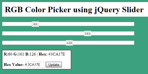
Now it’s time to build our RGB to Hex color conversion tool and learn the jQuery Slider UI Control in depth. We’ll have to use three sliders here to pick Red, Green and Blue color values and calculate Hex values and vise versa. I have also customized the Slider Handles to display the current slider value inside it. I have borrowed the color conversion functions from http://www.javascripter.net. The values and background color on the page changes dynamically as the user would slide the handles for choosing color values.

This is how my RGB Color Picker looks like:
jQuery Slider User Interface: RGB Color Picker with Hex Converter

For using the Slider UI you’ll have to include the UI CSS and other JavaScript libraries on your page from http://jqueryui.com. I have also created my own styles for the Sliders and its Handles. The JavaScript code for this tool is explained below:

  • $(document).ready(function(){...}); function is used to initialize the Slider UI Controls when the page loads for the first time. You can instantiate the controls individually by using $("#R"),$("#G"),$("#B") wrappers also, but I have used a common wrapper with all the div tags having sliders class $("div.sliders"). The Sliders are instantiated with min and max values from 0 to 255, step increment of 1, animation enabled to slide handle smoothly when user click outside handle on the bar, and assigned UpdateColor function to slide and change events. For more information and documentation on the Slider UI Control, visit http://docs.jquery.com/UI/Slider.
  • UpdateColor() function is used to get the latest values ($('#R').slider('option', 'value');) from the individual sliders and update the page background colors, slider handle values, and other values on page with conversion to Hex value.
  • HEXtoRGB() function is triggered when the user wants to convert Hex value (from text field) to RGB. The Hex value is first validated then assigned to the individual Sliders after conversion to R, G and B values respectively. UpdateColor() function is called again to update all the values on the page.

Here is the complete HTML page code for the Color Converter Slider Control:

<!DOCTYPE html PUBLIC "-//W3C//DTD XHTML 1.0 Transitional//EN" "http://www.w3.org/TR/xhtml1/DTD/xhtml1-transitional.dtd">
<html xmlns="http://www.w3.org/1999/xhtml">
<head>
<meta http-equiv="Content-Type" content="text/html; charset=utf-8" />
<title>jQuery Slider Control: RGB Color Picker</title>
<link type="text/css" href="http://jqueryui.com/latest/themes/base/ui.all.css" rel="stylesheet" />
<script type="text/javascript" src="http://jqueryui.com/latest/jquery-1.3.2.js"></script>
<script type="text/javascript" src="http://jqueryui.com/latest/ui/ui.core.js"></script>
<script type="text/javascript" src="http://jqueryui.com/latest/ui/ui.slider.js"></script>
<style type="text/css">
.sliders { margin: 20px 20px 20px 0px; width: 500px;}
.handle {
      font-family: Verdana, Geneva, sans-serif;
      font-size: x-small;
      text-decoration: none;
      text-align: center;
      padding-top: 3px;
}
.box {
      width: 250px;
      border: solid 1px #000;
      padding: 5px;
      background-color:#FFF;
}
h1 {
      padding: 10px;
      margin: 0px;
      background-color: #FFF;
}
</style>
<script type="text/javascript">
$(document).ready(function(){
      //initialize Slider Controls
      $("div.sliders").slider({ animate: true , min: 0, max: 255, step: 1, slide: UpdateColor, change: UpdateColor});
    UpdateColor(); //Update the Colors and Values on the Page
});
function UpdateColor(){
      var R = $('#R').slider('option', 'value'); //Get R Value from Slider
      var G = $('#G').slider('option', 'value'); //Get G Value from Slider
      var B = $('#B').slider('option', 'value'); //Get B Value from Slider
      var HexValue = RGBtoHex(R,G,B); //Calculate Hex values from R,G,B
      $('body').css("background-color", "#" + HexValue); //Set page background color
      $('#values').html("<b>R:</b>"+R+" <b>G:</b>"+G+" <b>B:</b>"+B+" | <b>Hex:</b> #"+HexValue); //Display Values
      $('#Rh').html(R); $('#Gh').html(G); $('#Bh').html(B); //Update R,G,B values on the slider handles
      $('#Hex').val(HexValue); //Update value in the Hex text field
}
function HEXtoRGB(){
      var Hex = $("input#Hex").val(); //Get Hex value from text field
      var HexReg = /^([a-fA-F0-9]{6})$/; //Hexadecimal value validation regular expression
      if(HexReg.test(Hex)==false){ alert("Invalid Hex Code"); return false; } //Validate Hex Value
      $('#R').slider('option', 'value', HexToR(Hex)); //Update R Slider Value
      $('#G').slider('option', 'value', HexToG(Hex)); //Update G Slider Value
      $('#B').slider('option', 'value', HexToB(Hex)); //Update B Slider Value
      UpdateColor(); //Update the Colors and Values on the Page
}

//Color conversion functions from http://www.javascripter.net
function RGBtoHex(R,G,B) {return toHex(R)+toHex(G)+toHex(B)}
function toHex(N) {
 if (N==null) return "00";
 N=parseInt(N); if (N==0 || isNaN(N)) return "00";
 N=Math.max(0,N); N=Math.min(N,255); N=Math.round(N);
 return "0123456789ABCDEF".charAt((N-N%16)/16) + "0123456789ABCDEF".charAt(N%16);
}
function HexToR(h) {return parseInt((cutHex(h)).substring(0,2),16)}
function HexToG(h) {return parseInt((cutHex(h)).substring(2,4),16)}
function HexToB(h) {return parseInt((cutHex(h)).substring(4,6),16)}
function cutHex(h) {return (h.charAt(0)=="#") ? h.substring(1,7):h}
</script>
</head>

<body>
<h1>RGB Color Picker using jQuery Slider</h1>
<div id="R" class="sliders"><a id="Rh" style="left: 0%; width:25px; height:16px; " class="handle ui-slider-handle" href="#"></a></div>
<div id="G" class="sliders"><a id="Gh" style="left: 0%; width:25px; height:16px; " class="handle ui-slider-handle" href="#"></a></div>
<div id="B" class="sliders"><a id="Bh" style="left: 0%; width:25px; height:16px; " class="handle ui-slider-handle" href="#"></a></div>
<div class="box">
<div id="values"></div>
<br /><strong>Hex Value:</strong> #<input name="Hex" type="text" id="Hex" size="6" maxlength="6" /><input type="button" value="Update" onclick="HEXtoRGB()" />
</div>
</body>
</html>

I hope this tutorial was simple enough to cover all the important aspects regarding the jQuery Slider UI Control. You can refer the documentation (http://docs.jquery.com/UI/Slider) for extra information on options, events and methods to play around with it.

Wednesday, September 9, 2009

JavaScript & DHTML Accordion Menu

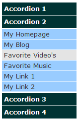
Accordion Menu’s are a very fancy form of drop down menu’s which are stacked over each other and open/close like the Accordion musical instrument. Reusing some of the code from my previous post on Dropdown Animated Menu, I have created a versatile and animated Accordion menu which works on both mouse over and moue down events.

Benefits of using this Accordion Menu Script:

  1. Zero coding required.
  2. Works with Mouse Over and Mouse Down events.
  3. Use multiple groups of menu’s on the same page without assigning id’s separately.
  4. Easily modifiable CSS.

This is how the Accordion Menu looks like:JavaScript & DHTML Animated Accordion Menu

The JavaScript code for this Accordion Menu is very straight forward with an Accordion Class containing all the functions. Put this JavaScript code inside the head section of your page. When the page is loaded for the first time, the init() function from the accordion class is called and all the div tags with class name accordion are assigned mouse events automatically. I have used JavaScript setTimeout function to delay the menu opening by few milliseconds so that the mouse over event can work smoothly over the menu. You can change the parameters for menu opening speed and delay inside the accordion class. To use mouse clicks for opening the menu, you can enable the onmousedown event inside the init() function of accordion class and comment the onmouseover event (no need to change the onmouseout event).

JavaScript Code:
<script type="text/javascript">
// Programmer: Abhinay Rathore
// Blog: http://web3o.blogspot.com

// Accordion Menu class
var accordions = []; // Holds objects for all the accordions on the page
var accordion =
{
    speed: 3, // Accordion opening speed
    opening_delay: 200, // Accordion opening delay in milliseconds
    run_timer: null, // Timer for active accordion
    init: function() {
        var divs = document.getElementsByTagName("div");
        var counter = 0; // Accordion Counter
        for (var i = 0; i < divs.length; i++) {
            if (divs[i].className == "accordion") {
                accordions[counter] = divs[i]; // Add to accordions array
                counter++;
                divs[i].active = 0; // Deactivate initially
                //divs[i].onmousedown = function() { accordion.activate(this); };
                divs[i].onmouseover = function() { accordion.activate(this); };
                divs[i].onmouseout = function() { clearTimeout(accordion.run_timer); };
            }
        }
    },
    closeOthers: function() { // Close all other open Accordions
        for (var i = 0; i < accordions.length; i++) {
            if (accordions[i].active == 1) {
                accordions[i].active = 0;
                accordion.start(accordions[i], -1);
            }
        }
    },
    activate: function(obj) { // Activate the accordion with opening_delay timer
        accordion.run_timer = setTimeout(function() { accordion.start(obj, 1) }, accordion.opening_delay);
    },
    start: function(obj, dir) { // Start opening Accordion
        accordion.closeOthers(); // Close all open Accordions
        obj.active = 1; // Activate the current one
        var accordion_heading = getElementChildNode(obj, 0);
        var accordion_links = getElementChildNode(obj, 1);
        var total_height = accordion_heading.offsetHeight + accordion_links.offsetHeight + 2;
        clearTimeout(obj.Timer);
        obj.Timer = setInterval(function() { accordion.animate(obj, accordion_heading.offsetHeight - 1, total_height, dir) }, 1);
    },
    animate: function(obj, min_height, total_height, dir) {
        var objHeight = obj.offsetHeight;
        if (dir > 0) { // Expand
            if (objHeight < total_height) {
                objHeight = objHeight + accordion.speed;
                obj.style.height = objHeight + "px";
            } else { clearTimeout(obj.Timer); }
        } else if (dir < 0) { // Collapse
            if (objHeight > min_height) {
                objHeight = objHeight - (accordion.speed * 4);
                if (objHeight < min_height) objHeight = min_height;
                obj.style.height = objHeight + "px";
            } else { clearTimeout(obj.Timer); }
        }
    }
};

// Returns Element Child node at given index
function getElementChildNode(node, index) {
    var element_node;
    var element_node_index = 0;
    var children = node.childNodes;
    for (var i = 0; i < children.length; i++) {
        if (children[i].nodeType == 1) {
            element_node = children[i];
            if (element_node_index == index) break;
            else element_node_index++;
        }
    }
    return element_node;
}
// Add events
var EventUtil = {
    addHandler: function(element, type, handler) {
        if (element.addEventListener) {
            element.addEventListener(type, handler, false);
        } else if (element.attachEvent) {
            element.attachEvent("on" + type, handler);
        } else {
            element["on" + type] = handler;
        }
    }
};
// Initialize Accordion menu when page loads...
EventUtil.addHandler(window, "load", accordion.init); 
</script>

The CSS for this menu script is kept very simple so that you can modify it to match the color and styling of your website. The most important thing you might have to change according to your website dimensions is the width and height of main accordion div and accordion heading div which can be done in the first group under CSS styling:

CSS Code:
<style type="text/css">
<!--
.accordion, .accordion_heading {
      height: 25px; width: 150px;
}
.accordion {
      overflow: hidden; z-index: 100;
      float: left; clear: left;
}
.accordion_heading {
      background-color: #033;
      border-top: 1px solid #FFF;
      border-bottom: 1px solid #FFF;
      cursor: default;
}
.accordion_heading p{
      font-family: Verdana, Geneva, sans-serif;
      font-size: small; font-weight: bold; color: #FFF;
      margin: 0px; padding: 4px 4px 0px 4px;
}
.accordion_links {
      position: relative;
}
.accordion_links ul{
      margin: 0px; padding: 0px;
}
.accordion_links li{
      list-style-image: none; list-style-type: none;
}
.accordion_links li a{
      font-family: Verdana, Geneva, sans-serif;
      font-size: small; color: #333; text-decoration: none;
      display: block; cursor: default;
      background-color: #9CF;
      padding: 2px 4px 2px 4px;
      margin: 1px 0px 0px 0px;
}
.accordion_links li a:hover{
      background-color: #E4E4E4;
}
-->
</style>

The HTML Code for Accordion Menu is pretty straight forward with a main container (accordion) which contains heading div (accordion_heading) and a links div (accordion_links) which contains an unordered list of links under the menu. Do not disturb the inner structure of the Accordion DOM layout or else you will have to modify the JavaScript to work with it as well. You can place the same code multiple times to create a group of menu’s stacked upon each other. The accordion div tag is left floated so you can use a main container on the left or right side on your website and place this HTML code in there multiple times.

HTML Code:
<div class="accordion">
<div class="accordion_heading"><p>Accordion Heading</p></div>
<div class="accordion_links">
<ul>
    <li><a href="#">My Homepage</a></li>
    <li><a href="#">My Blog</a></li>
    <li><a href="#">Favorite Video's</a></li>
    <li><a href="#">Favorite Music</a></li>
    <li><a href="#">My Link 1</a></li>
    <li><a href="#">My Link 2</a></li>
</ul>
</div>
</div>

del.icio.us Tags: ,,